


To Spell a World

To Spell a World

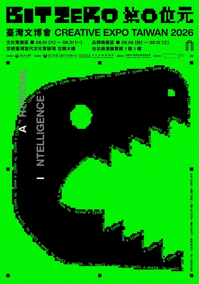
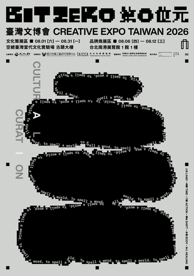
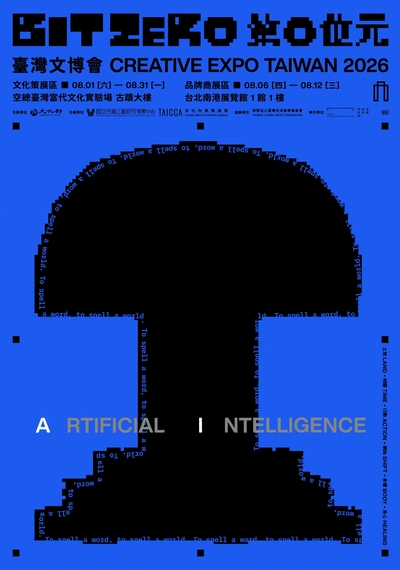
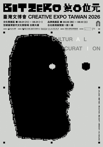
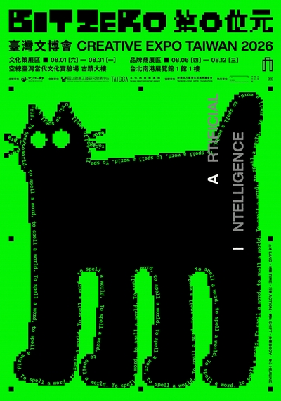
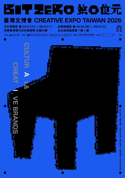
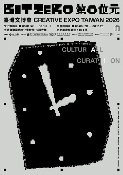
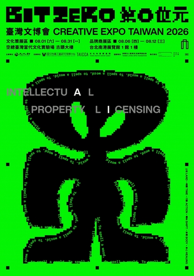
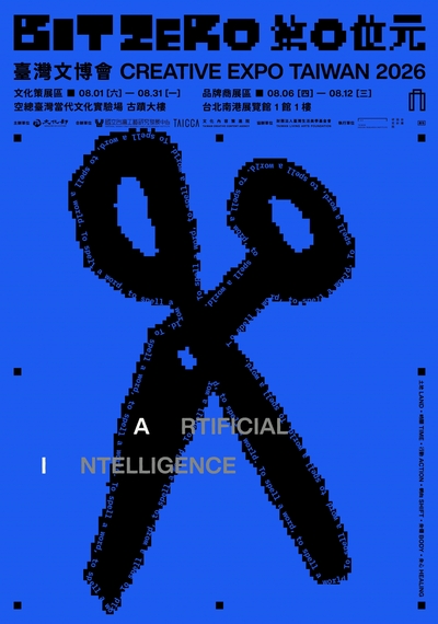
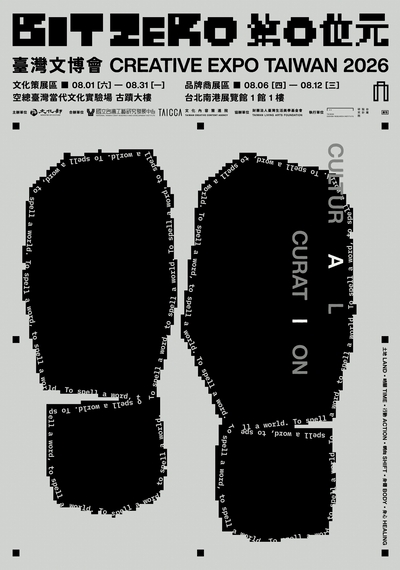
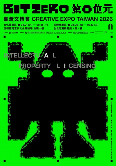
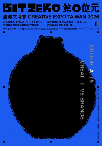
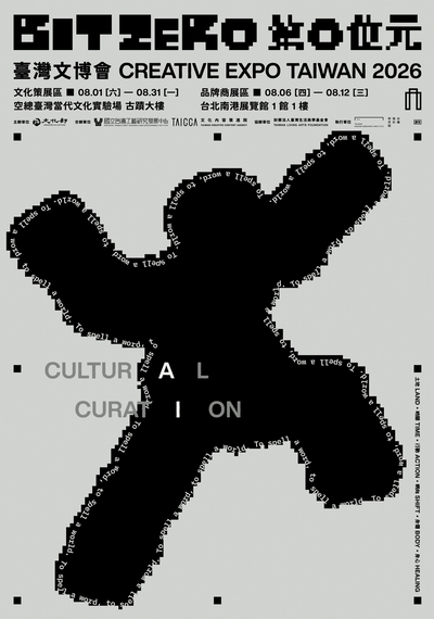
The visual system, created by design teams JOEFANGSTUDIO and OUT OF OFFICE under the concept of “To Spell a World,” begins with the premise that, within the digital realm, everything is constructed from bits and defined by the binary logic of 0 and 1. Drawing from the curatorial theme “Bit Zero,” the key visual compares AI prompts to contemporary “magical spells.” Centered on the idea that “form follows the spell,” it captures the moment of translation between virtual instruction and material manifestation. Text is no longer merely information here, but the starting point for shaping objects.

Core Visuals

Three core objects, each correspond to one of the three industry dimensions of Creative Expo Taiwan, embodying contemporary imagery and spirit.

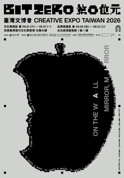
蘋果圖像 Cultural Curation
Apple

The apple serves as a metaphor for the original fruit of knowledge and inspiration. It draws upon the iconic incantation, “Mirror, Mirror,” whose central theme is reflection and revelation. Through mirror-like exchanges across disciplines and perspectives, it invites us to rediscover culture as a living organism of stories and meanings.

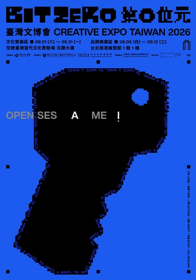
鑰匙圖像 Creative Brands
Key

The key symbolizes the essential tool for unlocking opportunity and forging industrial connections. Inspired by the spell “Open Sesame,” it represents the opening of markets and the unlocking of audiences. By releasing the boundaries of the cultural and creative economy, it points toward limitless possibilities for commercial innovation and growth.

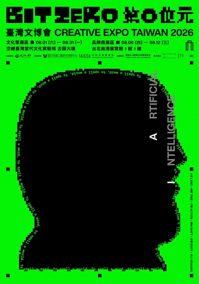
人像圖像 IP Licensing
Portrait

The human portrait materializes the original spirit and the core of the story, emphasizing "the endowment of soul and vitality." Countering "AI"—the powerful technological spell of the contemporary era—it blurs the boundary between fiction and reality within the dimension of IP, showcasing the diverse life forms interwoven by future generations under creative symbiosis.

Color Vocabulary

Digital markers of the system interface

The color settings focus on the vocabulary of digital technology, returning the visual communication to the underlying system aesthetics of "Bit Zero":

BSoD Blue:
Taken from the Blue Screen of Death, symbolizing the system's deepest primal state and the starting point of a reboot.
Keying Green:
Referenced from the green screen used for chroma keying in film and television production, representing a future space with infinite expandability that can be continuously "translated."
UI Gray-White:
Simulating the original background color of digital interfaces, serving as a neutral balance point that harmonizes the digital tension between blue and green within a stable framework.

Like primitive humans who have just discovered fire, we marvel at the magic of these spells, while continuously groping in the dark to create this new generation using symbols.

年度主視覺團隊

JOEFANGSTUDIO
JOEFANGSTUDIO

JOEFANGSTUDIO was founded in the summer of 2013 by designer Joe Fang. Since its inception, the studio has built a diverse portfolio across music, film, theater, exhibitions, branding, and visual direction for major ceremonies.

We believe that creation is a journey of listening and understanding. Our expertise lies in uncovering the unique identity of each project through a process of exploration, translating it into a warm visual language that resonates deeply with the public. We aim to make aesthetics more than just an out-of-reach concept, but an intimate presence that enriches everyday life.
OUT OF OFFICE
OUT OF OFFICE

OUT OF OFFICE is a strategy-led creative studio working across disciplines, from brand to spatial experiences.
Using vivid colors and intuitive graphics, the studio transforms ideas into experiences that can be seen and felt.